Profile Studio Tonne
Revealing our genetic makeup
Profile
by Grant Gibson
Grafix, June 2013
If the era of digital downloading seems a threat to music graphics, it doesn’t bother Paul Farrington of Studio Tonne, who is riding the crest of a new wave of music-based graphics. The unwitting pioneer’s love of music and propensity for tinkering with software has seen him invent his own genre of interactive sound visuals that, as Grant Gibson discovered, looks set to reinvent your music collection.
I don’t usually like people I don’t know referring to me as “mate” before I’ve met them. Perhaps this is the legacy of too many nights spent in brash Essex nightclubs where a sentence starting with “Oi, mate” would generally finish with “you were staring at my bird” or, better still, “you spilled my pint”. However, when Paul Farrington closes our first phone conversation with a chirpy “See you in twenty minutes then, matey” it’s perfectly fine. This could be because on an extremely wet day he’s offered to escort me from Brighton station to his studio but it’s more likely down to the fact that there’s just something very endearing about him. He has an unaffected charm and a neat line in self-deprecating humor that’s impossible not to warm to. The fact that his work is genuinely intriguing is an added bonus.
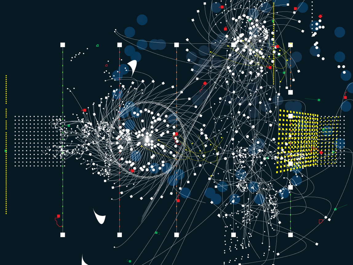
Attempting to pinpoint exactly what Farrington does under his pseudonym of Studio Tonne isn’t easy. Yes, there’s conventional two-dimensional design work for a slew of posters and CD covers and there’s commercial website stuff for the likes of perfume company Miller Harris but, arguably, it’s in the digital arts that he’s really found a niche. As I walk into Tonne’s bijou workplace, it quickly becomes clear where Farrington’s passions lie. In one corner of the simple U-shaped desking is a stack of amplifiers, effects units, sound modulators, and CD recorders, while an old-fashioned theremin gathers dust on the shelving above. And as we go over a brief history of his work, the thread that runs through virtually everything is music. Most obviously this can be seen in his various Soundtoys, the virtual product that first brought him to the wider consciousness. The toys are based around a simple visual idea. On the screen are a set of lines with a time bar running through each one, further down are a cluster of icons that contain different sound samples. All you have to do to create a song or, probably more accurately, a soundscape is to drag an icon onto the line.
He was brought up in Ellesmere Port near Chester—which Farrington describes as “A beautiful place. Very industrial. You drive through Shell Oil refinery and it’s industrial heaven. It’s just that city of pipes”—and you sense that his formative years were spent trying to work out how exactly he slotted into the world around him. He left school with two GCSEs, a love of music and a burgeoning interest in the album covers of 4AD, before doing a B-Tech, a HND, a degree in Liverpool and finally a master’s from the Royal College of Art in 1998. It was during his BA that he started to experiment with computers, developing a form of typography based around sound that used a Mac, a cheap microphone and Soundedit software. The letters of the alphabet were all given a particular sound that was fed into the machine and came back via the printer as a symbol. Discussing Designs for a Deaf Audience in hindsight, he says: “Language when it’s printed is kind of silent and I got into the idea of trying to create this architecture, where you can take the alphabet and move it into a different space.” The result was what he calls “the expression of sound and how that can be printed on paper”.
While his spell in Liverpool was enjoyable, the RCA appears to have been a more chastening experience. With his peers concentrating on the more traditional aspects of graphic design, Farrington’s near-obsession with interactivity marked him out as something different. “What I found hard about the Royal College was I got there and there were people who could really, really talk well about their work. And I didn’t really know what to talk about.” At the time, after all, it must have been very difficult to know exactly where his tinkering with software could take him professionally. Was it a new form of cyber-art or could it eventually have commercial possibilities? Interestingly Farrington is only just beginning to discover the answer to those questions now. “The last year was a real meeting point where my art-based projects and my commercial work merged,” he confesses. Certainly, it’s something that played on his mind during his sojourn at Kensington Gore. He started working with letterpress again and it was only when he met Brian Eno at the college that Farrington realised that what he was doing had real worth. In fact, Eno said of Sound Toys “this is the new music”.
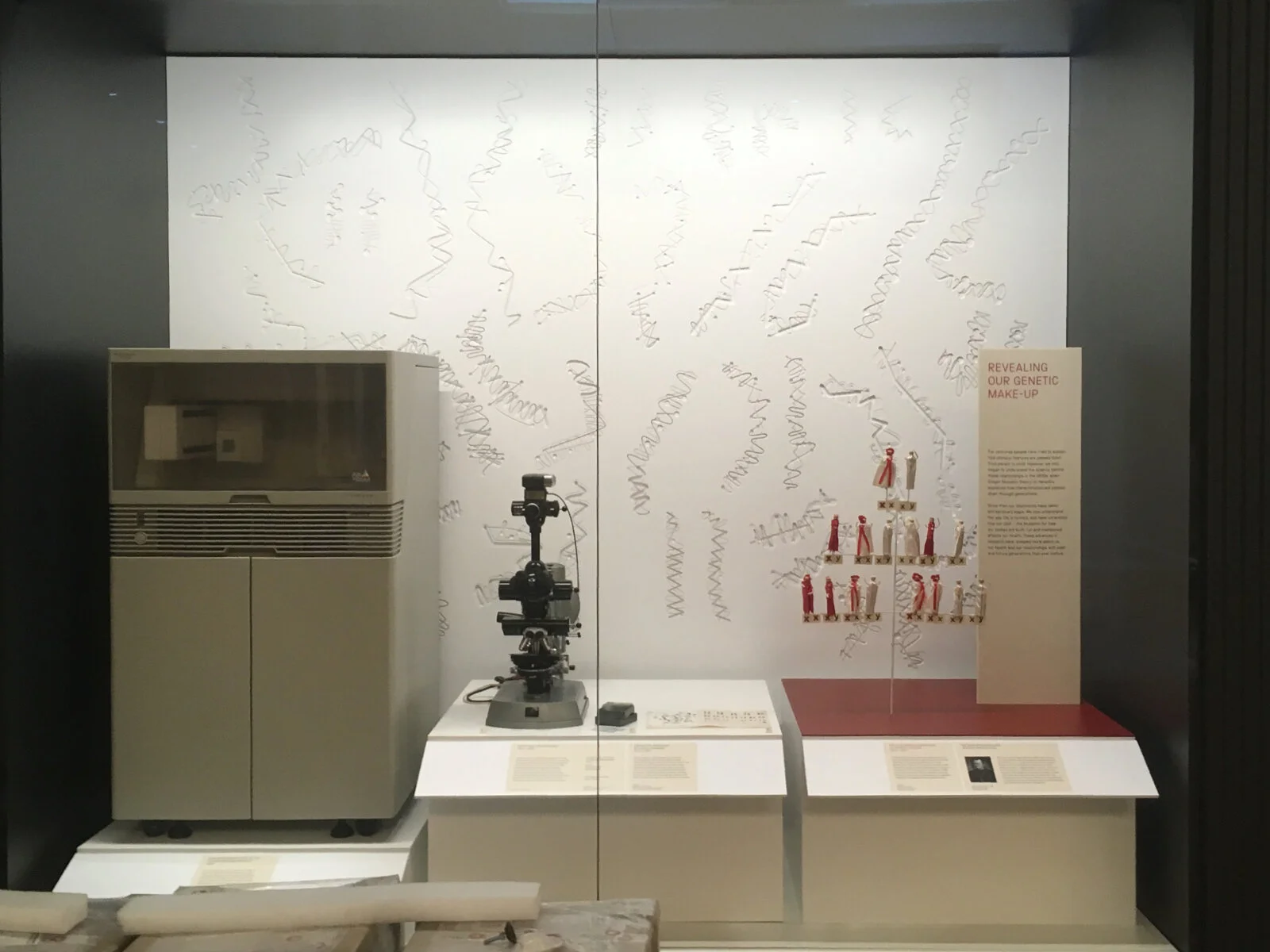
The final artwork measures 3 x 2.5 metres and has been created by routing shapes, several layers deep in white acrylic.
Design development
Perhaps it was this experience that created the interesting paradox that exists in his work. A man obsessed by creating and recreating systems, Farrington also has a real love of chance. The former, of course, peppers his life and work—most notably in the Soundtoys, his love of minimal German electronica music, and a new project based around measurements—while the latter tends to creep in uninvited. Take his practice’s name, for instance. Originally called Ton—meaning ‘sound’ in German—he discovered he couldn’t get a Hotmail address, so it became Tonne and, in his own words, “it just stuck really”. Likewise, he confesses as we take a tour through his portfolio that he never prints out any of his poster or CD cover artwork to check it, saying merely, “I kind of know what it feels like.”
It might also explain the hint of vulnerability that lingers in his make-up. This isn’t a designer completely cocksure of his own genius but one who, I suspect, constantly questions the validity of what he’s doing. As his experimentations in music and graphics began to take shape, for example, he was asked to participate at more and more festivals. This led to one of his tracks being put on a compilation album on the French label Bip-Hop, which, in turn, prompted an invitation to work on an entire CD for the Mute label. Yet the way he tells it gives you the impression that somehow the whole thing was a huge mistake. After all, he seems to imply, he’s not really a musician, just a chancer from Ellesmere Port with a computer. Then there was an epiphany. “One day I just thought music is art so you can just do exactly what you want really.” Inevitably, though, as the workload in the studio has increased and his family has grown—Farrington has two small children—so his musical output has declined.
This self-deprecating streak may also shed light on why he’s also continued doing conventional graphic-design work, such as his music-festival posters for the ICA’s Sonic Concrete and Norwich’s Hybrids. Farrington himself offers a more obvious justification. “The reason I do the print work is that I have a love of printing and paper and texture and ink and varnish.” It also, he says, comes as a bit of light relief from constantly doing websites because “it goes through another process—it goes to a machine—and it can change”. “
You know the way the ink sits on the paper or the way it’s cut. And when it’s printed it’s finished,” he adds. “The thing with websites is they just continue. The amount of sites we do where the clients want to be able to control them when they’ve gone live. Now you do a website and not only does it have to look and feel right, it has to be managed by the client. So you have to create some sort of structure underneath it.”
This professed wariness of internet design hasn’t prevented him taking on some high-profile projects, though, most notably the Hotel site, launched to coincide with Moby’s album of the same name. Taking his cue from the title, Farrington decided to build a virtual hotel, so when you register you’re given a room number and your name is added to a virtual guestbook. Facilities include a tennis court where you can play a set of pong with Moby and a VIP area complete with disco. There’s also a chance to make your own music in the Sonic Draw area. Here Farrington cut Moby’s tracks into pieces, giving each a separate colour. Then you can dip into each hue as you would a tin of paint and scribble on a piece of virtual canvas—the twist, naturally enough, is you don’t just see the daub, you hear it too. When finished, it can be saved in a Take Hart-style gallery. Like much of Farrington’s work, Hotel is witty, informative (if you really must know all about Moby) and, most importantly, intuitive. Not surprisingly it has gained a bit of a cult following.
Next, the studio, which now includes a junior designer and an intern, will be concentrating on revamping its website and researching a book on how things are measured. Farrington will also be collaborating on a new performance project based around the notion of time to be staged in Sweden which will include the musician Hakån Lidbo, the choreographer Asa Unander Scharin and filmmaker Anders Weberg. You fancy this is the tip of a pretty considerable iceberg, however. Farrington may have been inspired by the likes of Vaughan Oliver but he occupies an interesting position as part of the generation that is bridging the gap between new and old media. And it’s a place that could provide some interesting opportunities. After all, as his portfolio proves, designers wanting to work with the music industry can no longer rely on CD or album cover art commissions. Instead they have to get more inventive. The new challenge (once the ubiquity of the iPod becomes tedious and the novelty of the technology itself wears thin) will be how to make downloads visually stimulating. As Farrington points out: “iTunes is the biggest download thing for music but it’s so sterile. You can store the music on iTunes but what does it look like? A record collection is very physical, it ages.” Farrington believes that the way the studio works is beginning to change. Rather than reacting to commissions, he wants to create products and take them to people—if designing a digital download library that ages with you is the first result then I think he’s on to a winner. Nice one, mate.
Microscope slide made by Charles Ford and John Hammerton


